1. Essential Definition: A Tea Cup as an Emotional Developer
The hue and aroma of tea liquor objectively express the intrinsic quality of tea leaves. The cup that holds it serves as the final filter for your subjective state of mind. The Palette series is built upon a hypothesis: the color of cup you choose today is not a random aesthetic choice, but rather your subconscious setting an emotional foundation for the upcoming tea experience. These six hues represent six fundamental emotional languages. You choose not merely a vessel, but an emotional frequency for the tranquil moments ahead.
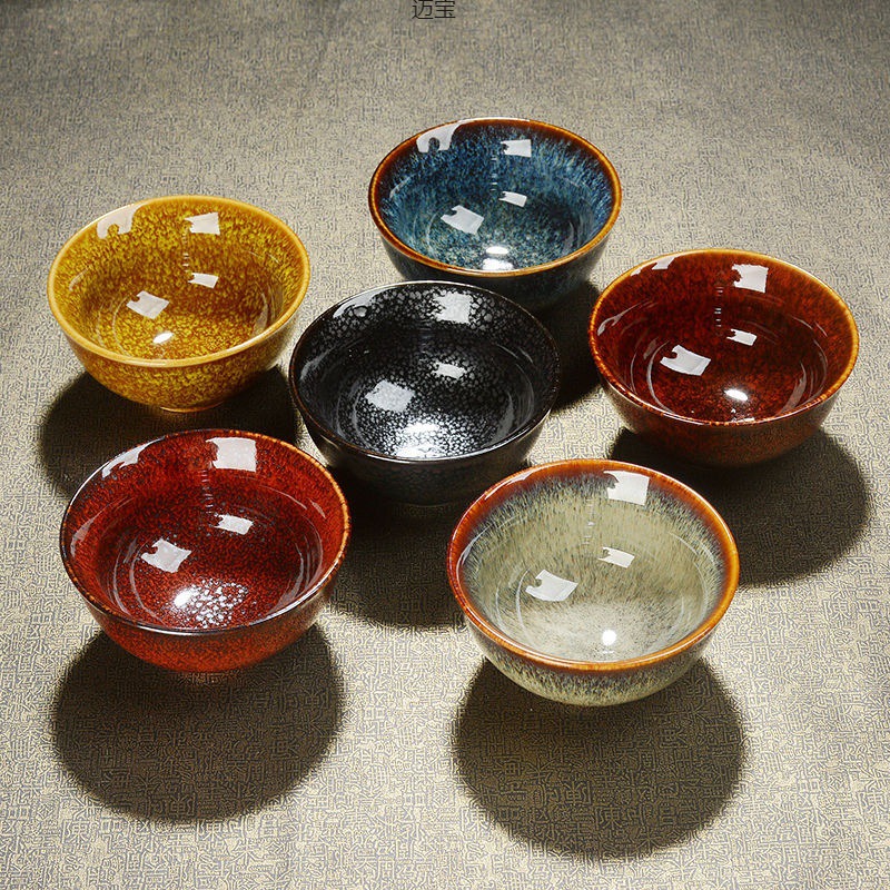
2. Core Concept: Six Frequencies, One Spectrum
Using glaze as our language, we define six distinct emotional frequencies that form a complete sensory spectrum:
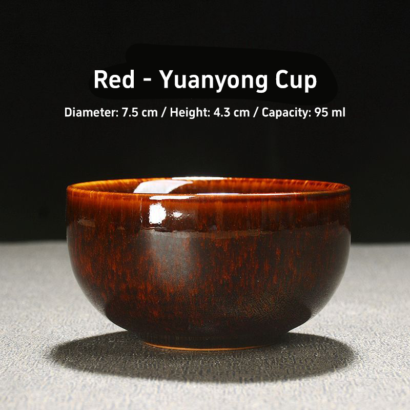
Red|Awakening
Frequency Interpretation: Not a vibrant crimson, but a serene vermilion. It symbolizes the first stirrings of dormant energy and a gradual awakening. Ideal for mornings or when drawing strength from fatigue, it gently rouses the senses with a warm, rich hue.
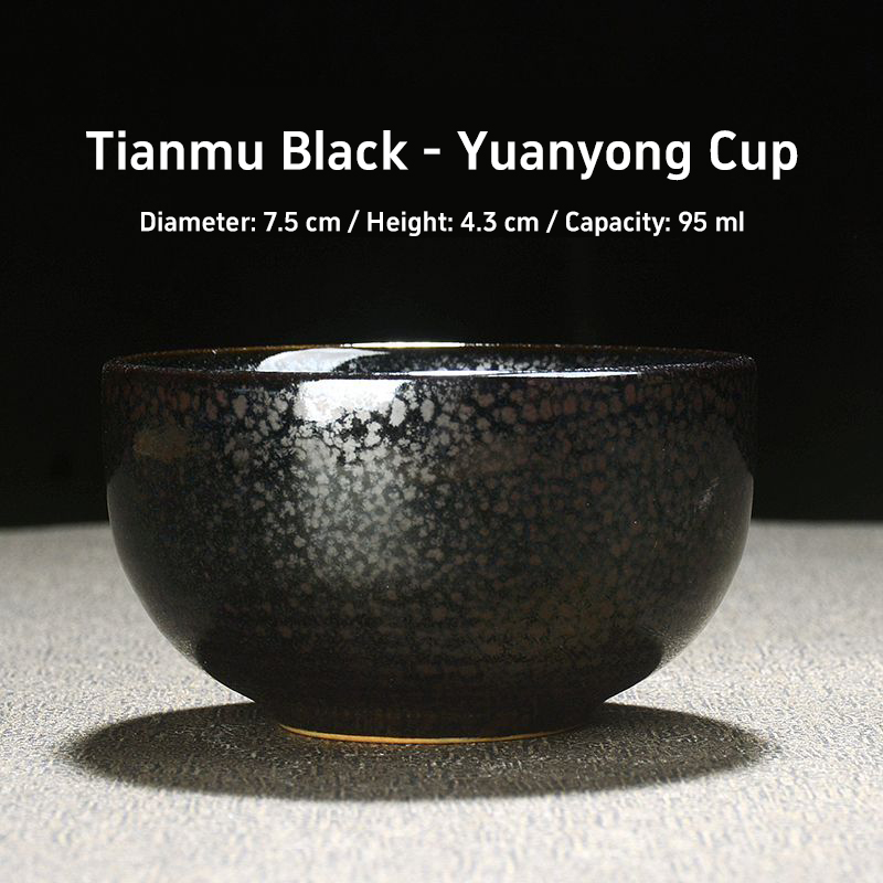
Tianmu Black|Submergence
Frequency Interpretation: Inspired by the profound, mystical black of Song Dynasty Tianmu tea bowls. It absorbs all light, creating a zone of absolute visual stillness. When you require extreme introspection, eliminating all visual distractions for deep thought or meditation, it serves as your anchor for descent.
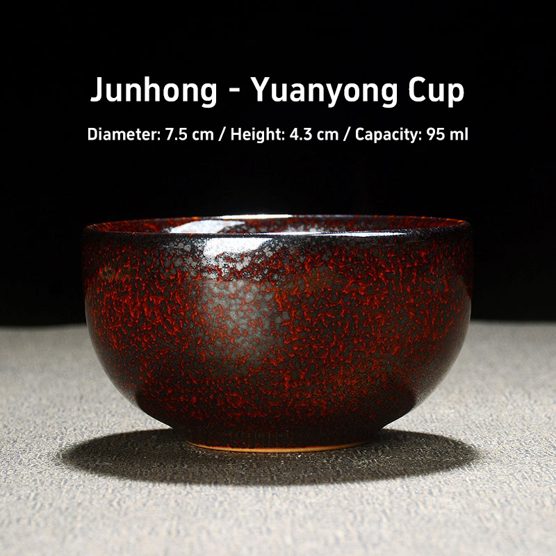
Junhong|Coalescence
Frequency Interpretation: Capturing the serendipitous, warm underglaze red from Jun Kiln's glaze transformations. It embodies the convergence of warmth and focused energy. Ideal for moments requiring mental concentration, gathering scattered thoughts into focus. The warm hue within the cup serves as a visual anchor.
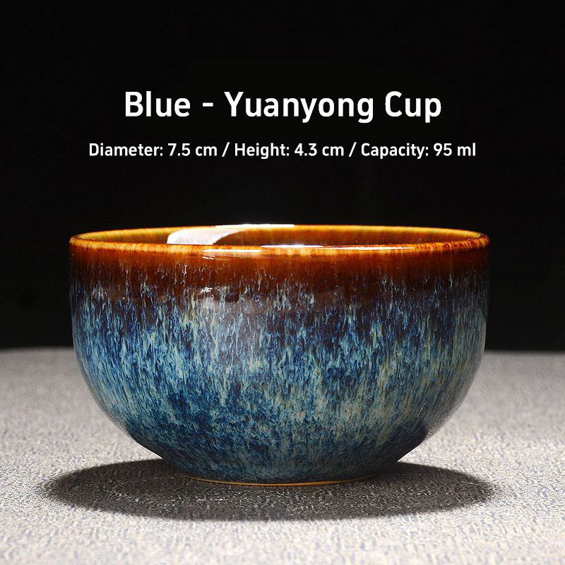
Blue|Calm
Frequency Interpretation: Like the deep sea or dusk's gray-blue hues. It carries a visual psychological suggestion of cooling and tranquility. When emotions are turbulent or calm judgment is needed, it visually constructs a rational, expansive, and stable backdrop for you.
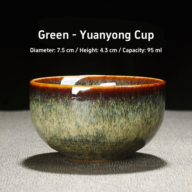
Green|Breath
Frequency Interpretation: Like the gray-green underside of new leaves, brimming with oxygen. It evokes growth, renewal, and steady breathing. Ideal for relieving stress or seeking moments of freshness and connection with nature, it becomes a tranquil garden held in your hand.
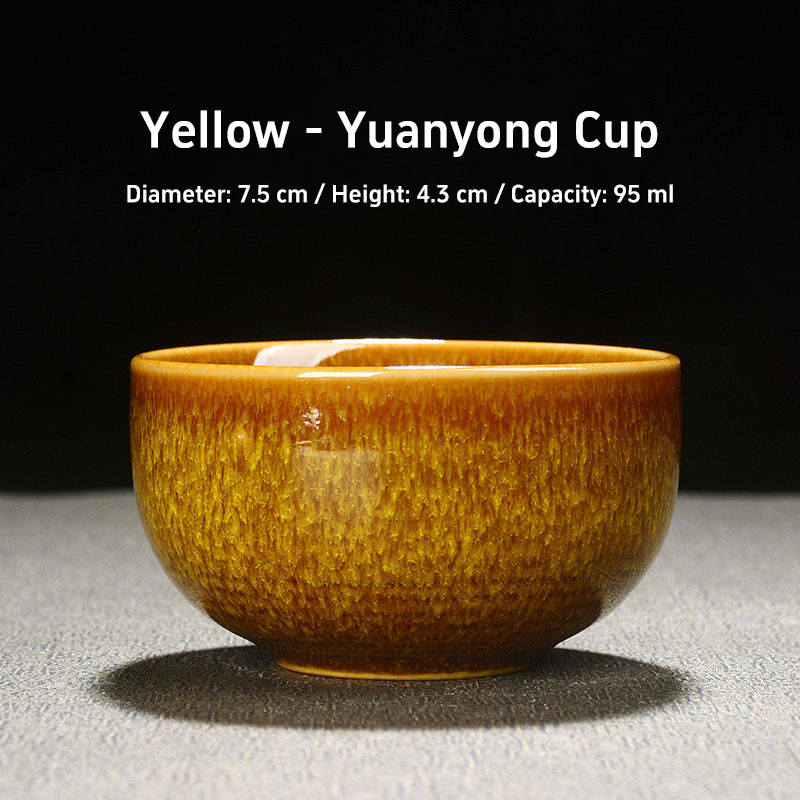
Yellow|Clarity
Frequency Interpretation: Like soft light filtering through rice paper, it embodies light itself rather than a light source. It symbolizes clarity, brightness, and transparency of thought. When you need to untangle complexities and make ideas crystal clear, it is the ideal choice.
3. Serene Details: The Temperature Code at Your Lips
True emotional interaction occurs at the most intimate point of contact—the lips and the rim of the cup.
At the rim of each cup, we apply an extremely thin, nearly invisible transparent glaze. Yet, due to the subtle difference in thermal response between the body glaze and this transparent layer, when sipping hot tea, your lips perceive an indescribable yet undeniable “tactile warmth” unique to each color.
For instance, holding the “Black” cup feels cool to the hand yet warm to the lips, while the “Red” cup conveys a consistent, steady warmth from touch to lip contact. This isn't a physical temperature difference, but a synesthetic effect sparked by color psychology and meticulous craftsmanship within your senses. It's a secret—verifiable only by you—about how color directly converses with the body.
4. Specifications & Selection Guide
Shape & Capacity: A classic, rounded cup form without unnecessary angles. The 95ml capacity is precisely calculated to hold a single, uninterrupted serving—enough for a complete period of focused attention without the distraction of refilling, synchronizing your drinking rhythm with your flow state.
Craftsmanship Core: High-purity ceramic body coated with an exclusive matte mineral glaze. Rich, warm hues without harsh reflections. Single-fired at 1320°C for dense, resonant texture.
Usage Guide:
Upon waking, resist immediate choice. First discern your present inner “hue”—is it chaos, anxiety, or calm? Then select a cup that resonates with this state or guides you toward your desired one.
Try “mirror” pairing: When your mind is turbulent (Blue), opt for clarity (Yellow), using color as visual guidance and balance.
Collecting all six colors isn't for display, but to gain full control over your emotional spectrum. Displaying them together creates a silent map of inner possibilities.
(Display Notes)
Tea has its own flavor, while the mind requires coloring.
Before sipping, first select the tone for your present tranquility.
MOKINN “The Palette”: Using glaze hues as language, it assists in your final inner calibration before savoring.